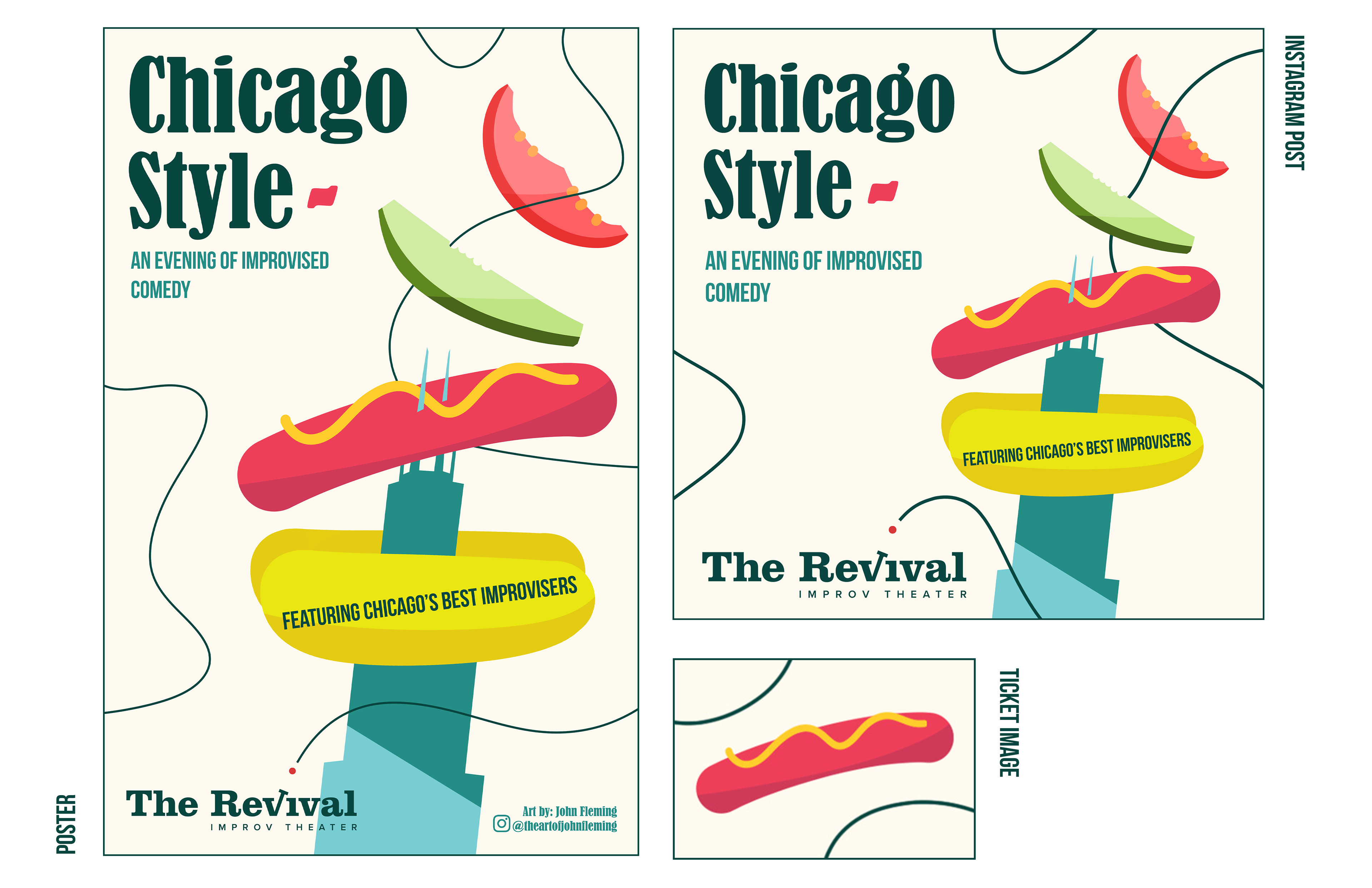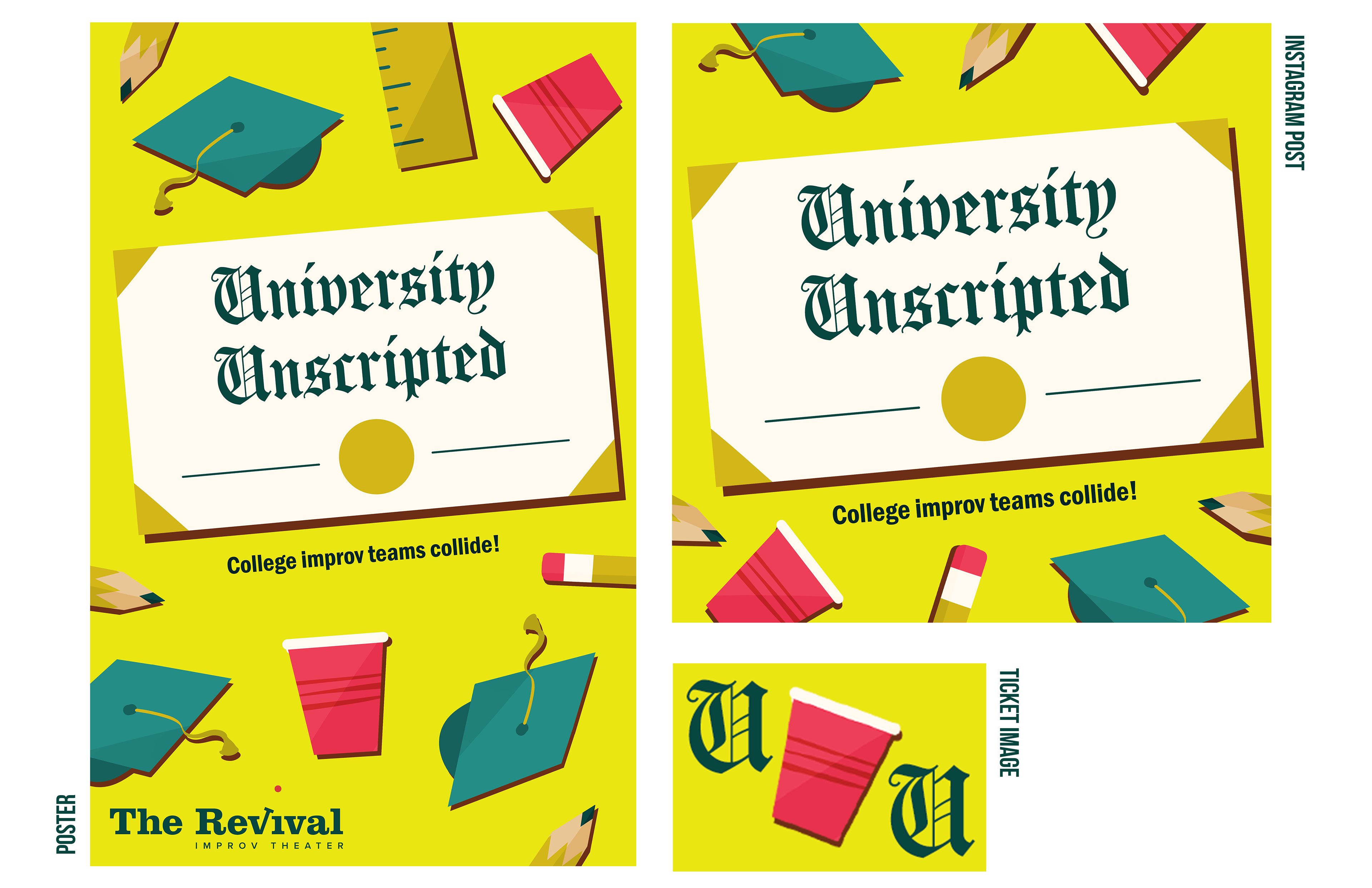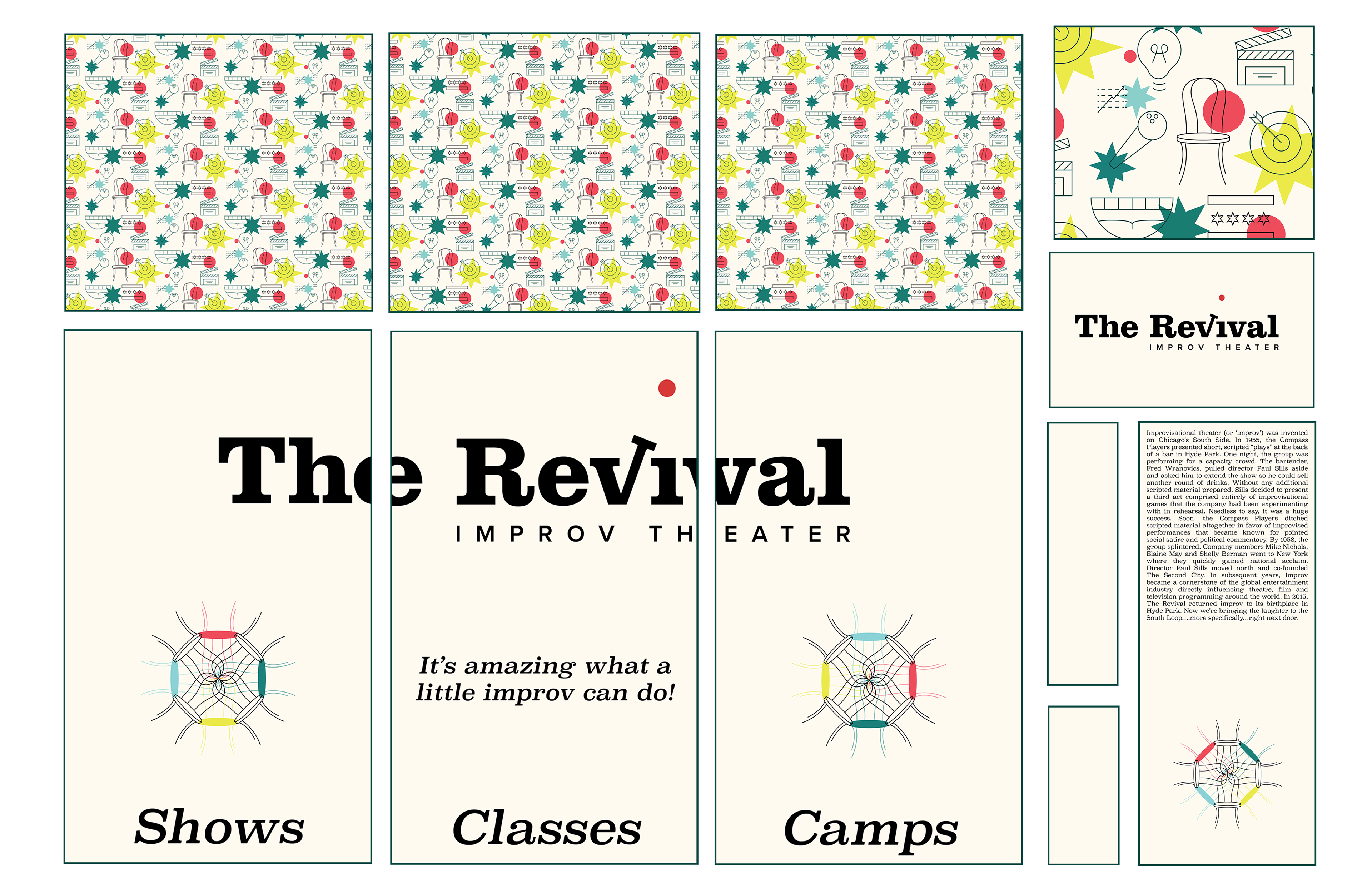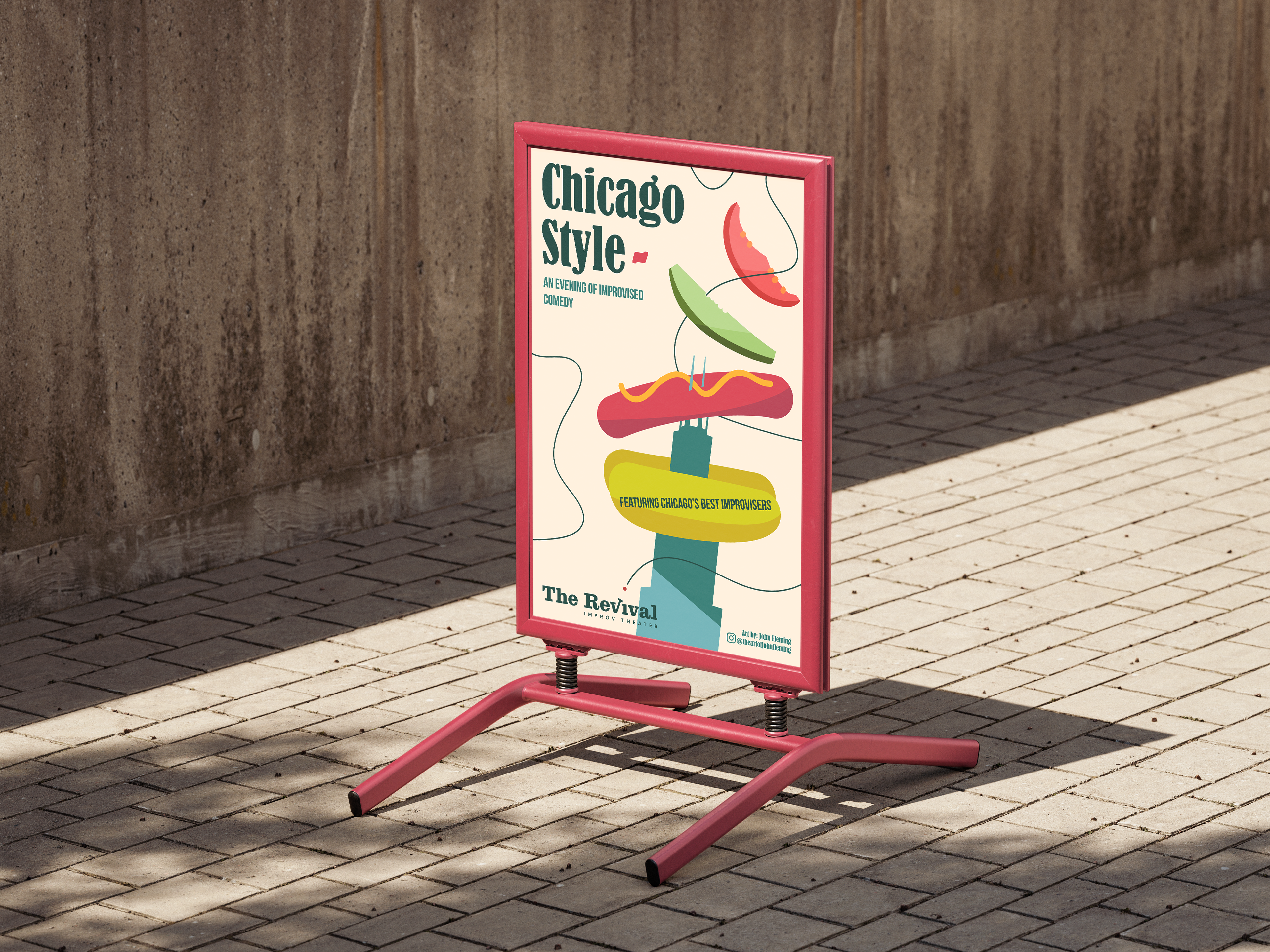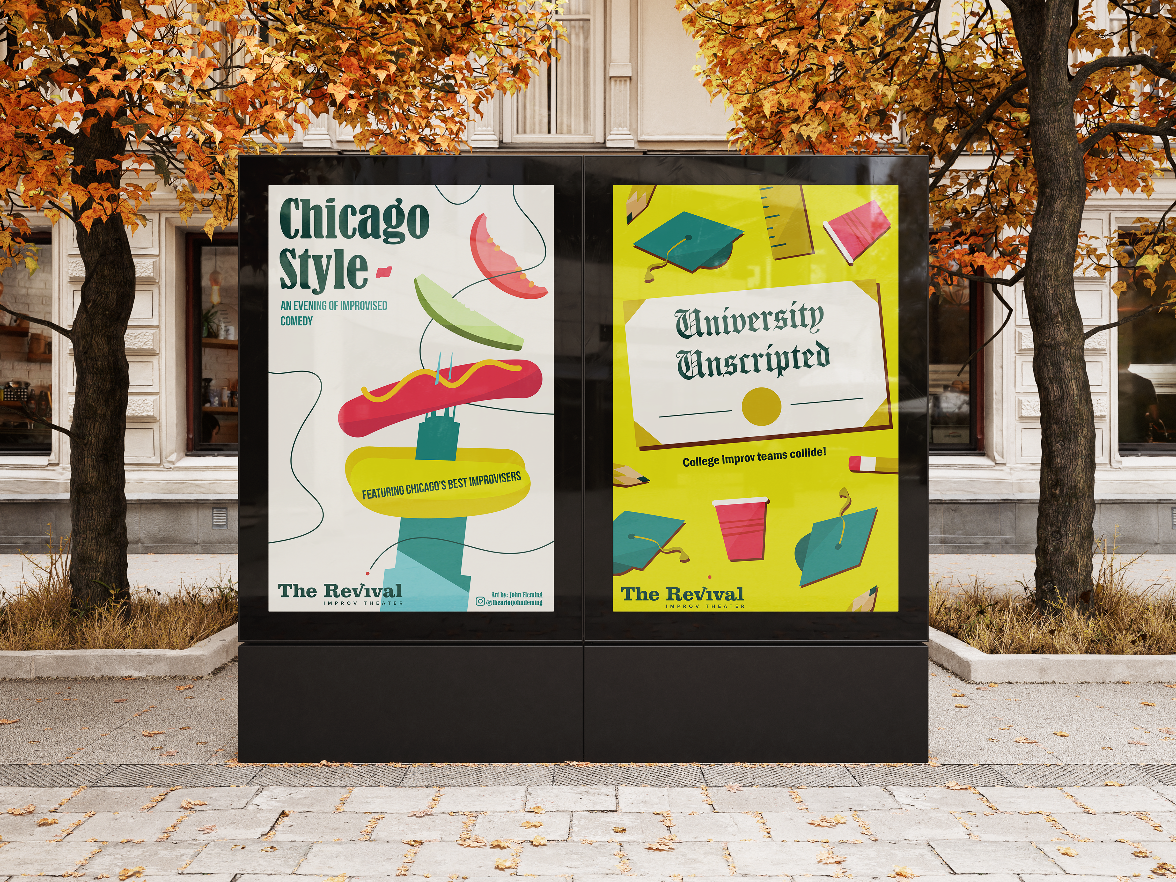
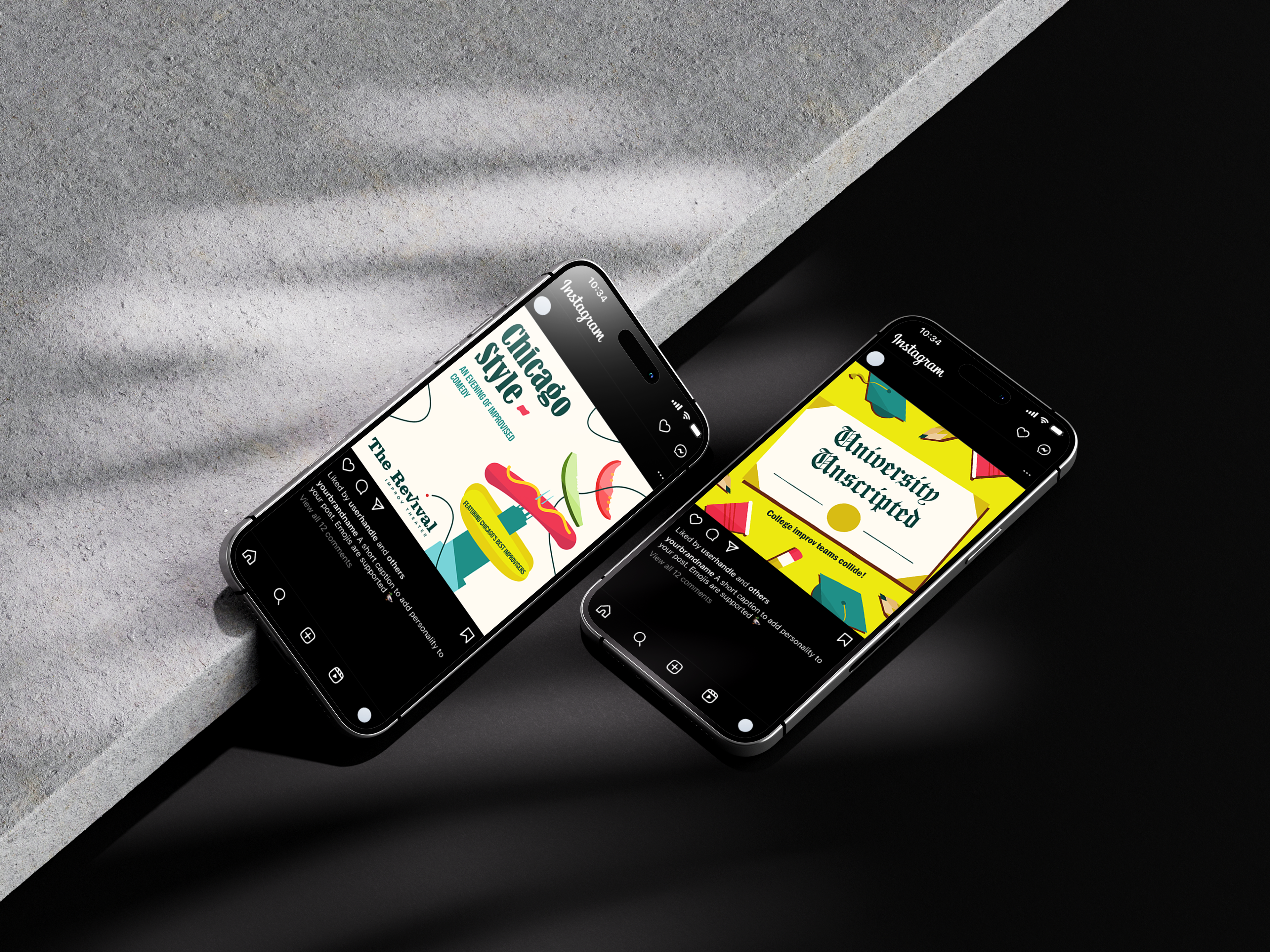
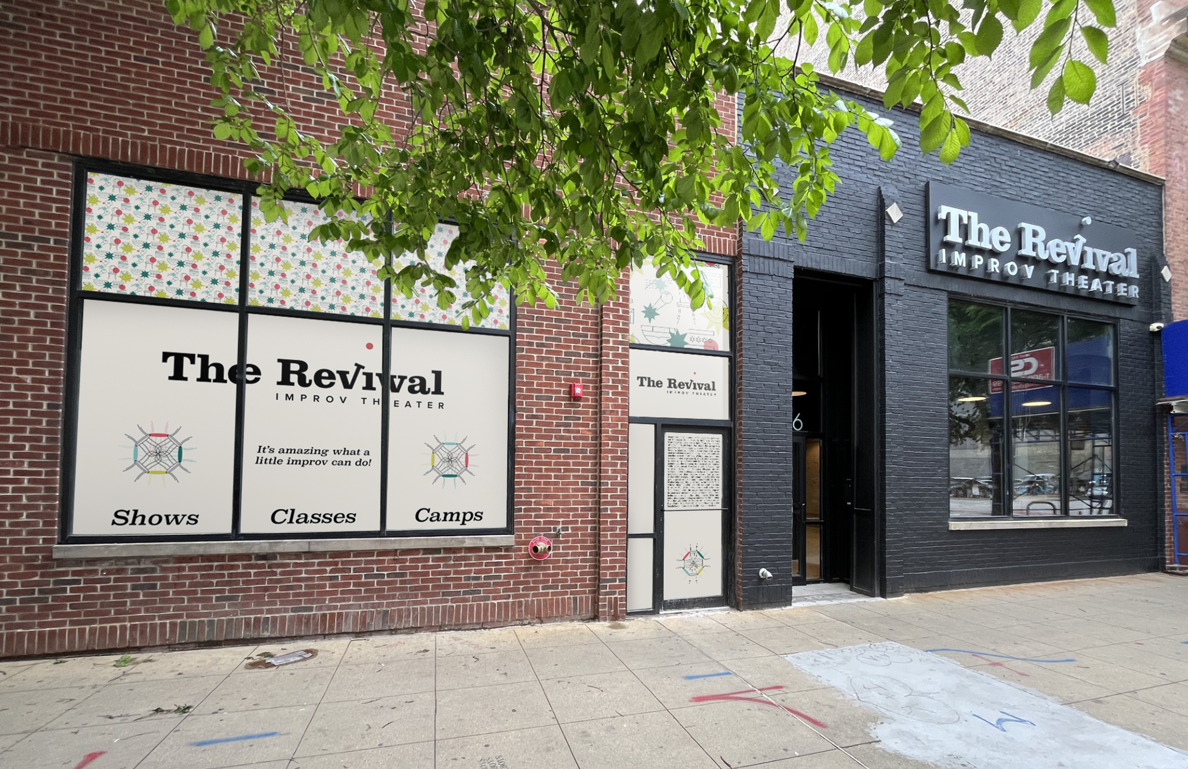
The Revival approached me with the task of making advertising for some of their main events. I was asked to combine everyday objects/themes and putting them into a humorous setting while also following their vibe and overall aesthetic made for bright and attention grabbing visuals. These posters ended up all over the south loop of Chicago. This was my first big client, so it was fun to learn how to communicate with somebody who was interested in learning about design and illustration. Another thing I learned was how to adapt my designs to several different sizes/uses, as they required a set of deliverables for each design campaign to fully implement their vision.
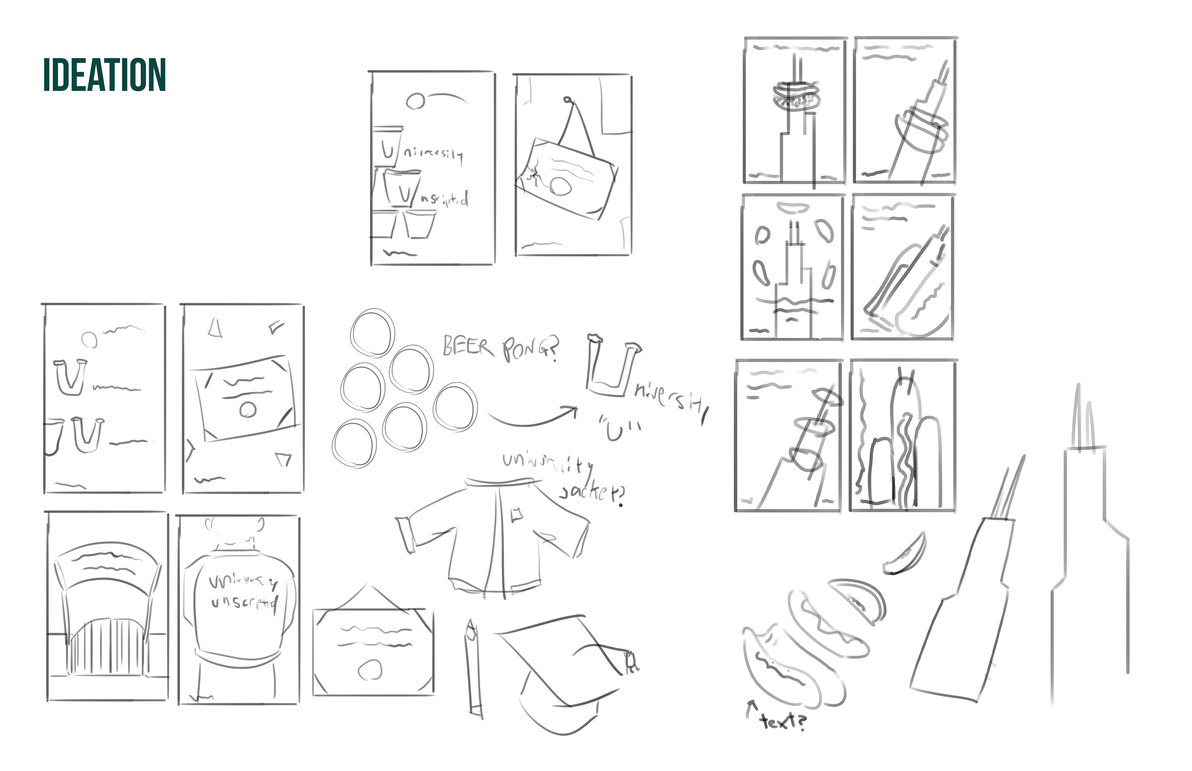
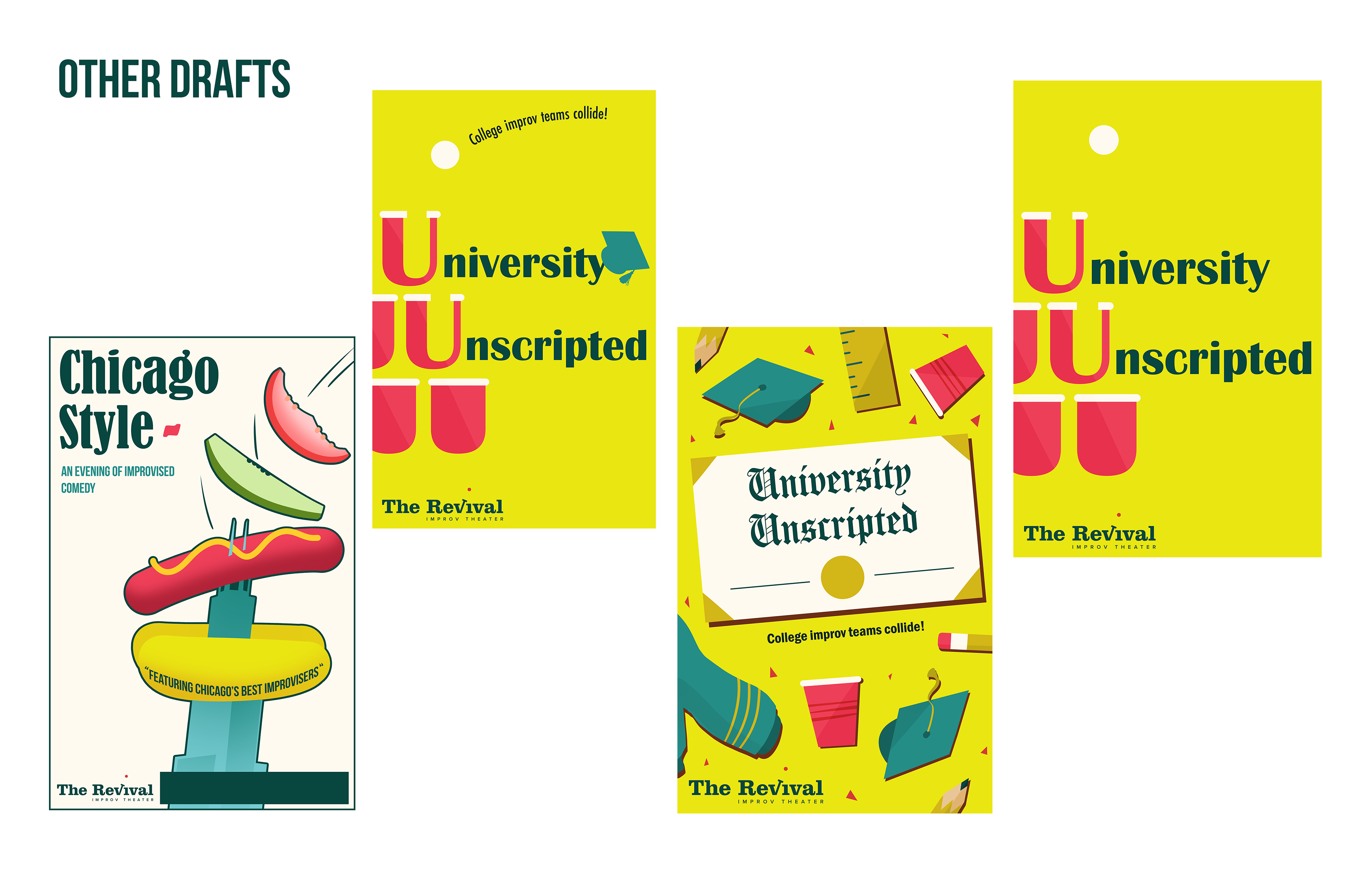
After sketching, ideation, and picking good fonts to use, some higher fidelity drafts were drawn out. Here were some of the more significant ones for both projects. The idea for "Chicago Style" was already very well received, it ended up not needing as many run-throughs to get it right.